Last Updated on Tue-Mar-2025 by Robert Bogere
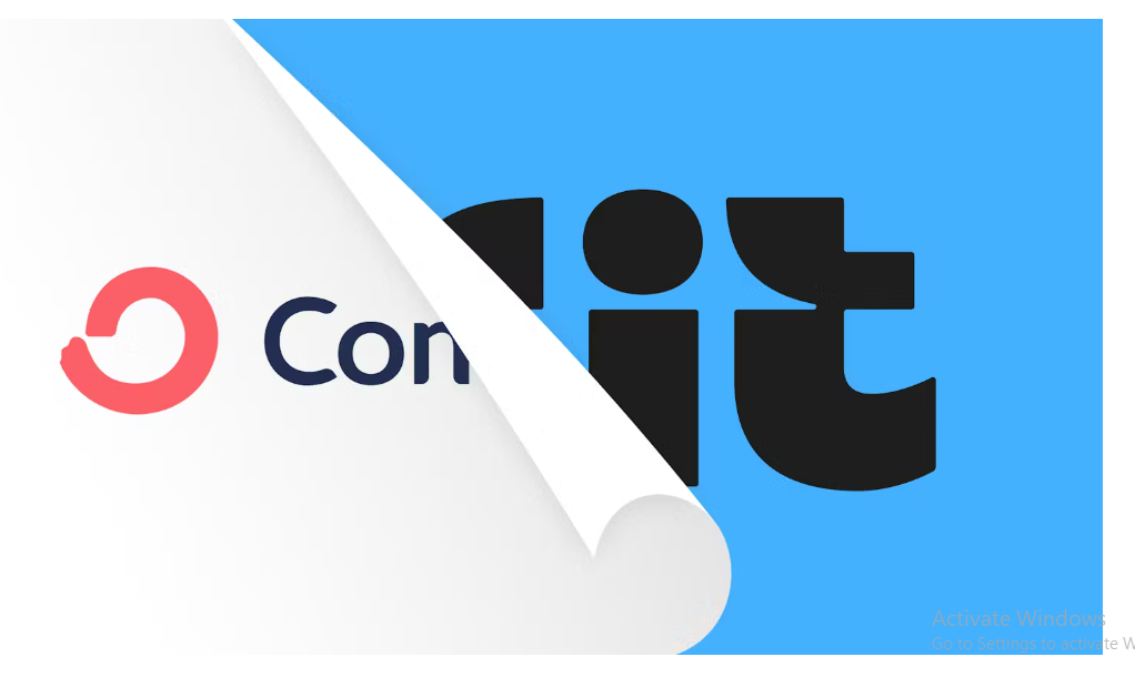
ConvertKit has earned $32.1 million. Since its operation, it has sent 112.3 billion emails with 5.8 Million subscribers. According to Landor, 74% of S&P 100 companies have rebranded within their first 7 years of operation.
For ConvertKit, it has been 11 years since its inception. Looking at the duration 74% of companies took, ConvertKit’s rebrand was overdue.
In 2018, they rebranded to Seva but received much criticism from their target customers (creators) and decided to pull down their rebrand.
In this article, I’ll be sharing what rebranding is, the purpose of rebranding, ConvertKit rebrand strengths, and missed opportunities. As I prepare myself, grab your seat plus coffee and we go through this. Shall we?
Find out more about creating your brand positioning statements here.
What is rebranding?
Rebranding is a marketing strategy in which a new name, term, symbol, design, concept, or combination thereof is created for an established brand with the intent of developing a new, differentiated identity in the minds of consumers, investors, and other stakeholders – Wikipedia.

Frontify defined rebranding as a strategy that involves changing a company’s image, identity, or positioning in the market.
What is the purpose of a rebrand?
1/ Your business may rebrand to update an outdated brand identity – ensuring its identity reflects your company values, mission, and vision.
2/ As your company changes, your messaging may no longer serve your brand purpose – this calls for a rebrand to align your communication with target customers.
3/ You may rebrand because of changes in your company structuring or entering new markets – also this calls for a rebrand.
Bynder surveys found that the most common reason for rebranding as identified by 57% of marketers is to update brand identity.
ConvertKit’s past function was converting creators’ target audience into customers. According to ConvertKit, their name no longer reflected their mission and vision. Why? It sounded;
- Too technical
- Too niche, etc.
As they claim to develop an operating system for the creator economy, they wanted a new name that;
- One word
- Not too technical
- Tied to the mission
- Easy to hear and spell over the phone
Kit checked all the boxes. Other than the name ticking all the boxes, their rebrand involved a new name, brand strategy, brand identity, and philosophy for their product.
Looking at developing your brand strategy? Find everything here.
Before going into the nit grits of their rebranding, let’s dig into what the name “Kit” means.
A kit is a set of things such as tools used for a particular purpose or activity — Cambridge Dictionary.

The Dictionary defines a kit as a set or collection of tools, supplies, instructional matter, etc., for a specific purpose.
With its meaning, they scored. Why? According to Wisernotify, 77% of consumers make purchase decisions based on brand name. Here Kit is introducing the App Store of 5 new apps namely;

1/ Keyboard – Helps you add a CRM to your Kit account.
2/ Saavycal – Helps you add a 1:1 booking widget to your email.
3/ Wordsmith – Helps you turn YouTube videos into email newsletters.
4/ Mighty – Helps you connect your mighty community and pull content from your community.
5/ Segmentrics – Helps get actionable information from insights, a dashboard built-in partnership.
Want to try out these Kit new apps? Get started here.
On top of that, it has new game-changing initiatives to build Kit into the creator operating system like;
1/ Site – You have a chance to create your site directly on Kit.
2/ Polls – Now you can set up polls from your Kit email editor to engage with and collect information about your business subscribers.
3/ Newsletter plan – You get up to 10k subscribers for free. Here you get a basic automation and email sequence.
But what are other factors K evokes? From the English alphabet, K suggests clarity, decisiveness, and precision. It’s associated with movement and energy due to its use in words like;
- Key
- Kick
- Knock
K is a hard consonant and less gentle. This makes it stand out and feel more modern. Its 2 meeting lines suggest stability and connection.
And it’s an uncommon letter in the English language. This makes it stand out more in brand names.
ConvertKit rebrand strengths
1/ Their brand strategy is based on creators seeking purpose beyond revenue. This is a good emotional appeal.
“Our brand strategy was informed by conversations with creators. Through conversations with creators, we learned that while earning a living is an important aspect, what creators value even more is the purpose behind their work” — Charli Prangley, Creative Director, Kit.
2/ The small arrows between the letters (K) and (T) represent the exchange of value between creators and their audience – it shows creativity and engagement moving in both ways.
The lowercase of letter i symbolizes the creators. This is on point. The designs show attention to detail. Research shows that 93% of buyers make decisions based on visual appearance – Foundry12.
3/ The decision to make it modern and clean with small details was spot on.
Using Kit Blue and the custom font of Kit Sans blends modernity. Kit Blue feels respectful to ConvertKit past origins. And blue is a trustworthy color.
Are you in search of brand positioning strategies? Find out more here.

“Kit sans stands for boldness, sincerity, and expertise. It’s sleek and professional with a touch of warmth and personality in its curves” said Charli Prangley, Creative Director, of Kit.
Does the blue fit well with K associations? Let’s see…
Charli Prangley said they based on 3 tonal principles;
1/ Bold – Kit is confident in its expertise and unafraid to be unique
2/ Expert – They believe in creators and the work we do. This is why they make us the heroes of the brand.
3/ Sincere – With their 10 years of experience, they claim to know what it takes for creators to succeed.
Let’s look at the brand colors which align well with associations of the letter K;
1/ Neon green
2/ White and cool grays
3/ Deep navy blue, black
4/ Fiery red – Such showcases energy, passion, and decisiveness.
5/ Electric blue – These evoke modernity, innovation, and energy. This means they were on point with using Blue kit.
ConvertKit rebrand missed opportunities
Concepts like focusing on value exchange and the use of blue kit, are common themes in branding. Yes, they’re good but don’t push the boundaries of creativity.
They would think of unexpected elements to bring the bold tonal principle more alive.
1/ Value exchange idea
It’s insightful though it doesn’t make KIT stand out in the new creator economy.
Direct competitors like Beehiiv also focus on building connections and creator value exchange. I’m waiting to see how Kit will bring this idea more live.
2/ Blue Kit selection
Blue is energetic. And shows trustworthiness but it’s overused. Almost 65% of Fortune 500 companies use blue. A different color could have helped Kit stand out more visually.
According to Wisenotify, 85% of buyers claim color is the primary reason for buying a product. And 80% of people believe color increases brand recognition.
All in all thumbs up to the Kit brand team. They did a good job which they failed in 2018 when they rebranded ConvertKit → Seva.
ConvertKit rebrand conclusion
Reflecting on the reasons given by ConvertKit’s creative director and the duration of their operations duration, rebranding was overdue because ConvertKit had seized being just a converting tool.
Deciding to go with a custom Kit sans font was spot on. This makes your brand stand out because no brand happens to have a similar font to yours.
Having rebranded in 2018 and got issues, it showed they learned from their mistakes. This time, they considered their target customers (creators) part of their rebranding process.
The next time you consider rebranding, let your target customers be part of your process. As we close today’s article, what do you think about ConvertKit rebrand? When are you thinking of yours? Need any help about the same? Let’s have a chat today.

He specializes in turning SaaS startups into brands customers trust and buy from. He helps founders cut through the noise with a clear messaging and positioning strategy that drives conversions.
With 10+ years of background in branding and strategic communication, Rob has worked with startups struggling to stand out.
He understands the challenges of building a brand beyond a product and focuses on crafting unique value propositions that make SaaS businesses memorable and profitable.
If your SaaS isn't selling, it's not your product, it's your positioning. Let's fix that!


