Last Updated on Fri-Mar-2024 by Robert Bogere
Think of your brand visual identity as picking an outfit for your big event, like your wedding. Each element—logos, colors, shapes—is like choosing what you’ll wear.
In the business space, this is your brand’s visual identity. This article is like a guide through your big event, showing how your choices will shape what people think about your brand.
I’ll talk about the art and strategy behind creating your visual story, exploring why it’s important to make a connection with people.
It’s a bit like choosing the perfect outfit to leave a lasting impression in the crowded room of consumer opinions. Let’s dive into this journey together.
What is brand visual identity?
Visual identity is a combination of different visual components that create a unique image for your brand.
Brand Fabrik defined it as all the graphical imagery items of your brand image.
Whatever your target audience sees in association with your company forms part of your visual identity. Your brand visual identity focuses on the visual elements representing your brand.
Personally, brand visual identity is the visual appeal of your brand. Appeal and feel of what your target audience sees towards your brand.
Elements of Brand Visual Identity
Your brand identity should comprise various elements. Putting together such elements instantly recognizes your brand by people, thereby attracting them to become your supportive customers.
Your brand’s perception will be determined by key elements as below;
- Logo
- Shape
- Typography
- Color palette
- Photography
1. Shapes
Before thinking of anything, you need to think of a shape to use for your brand. Consider shapes as your actionable reaction from your target customers.

They’re various kinds of various shapes
I] Straight-edged shapes
Such shapes are triangles, rectangles, squares, etc. Shapes make people think of efficiency and strength. They can create stability and trustworthiness for your brand.
II] Round shapes
These shapes portray a distinct feeling from the people. Such types of shapes are ovals, circles, ellipses, etc. Round shapes create a feeling of community, unity, teamwork, etc. For example, my brand has a circular shape.
2. Typography
This is your selected fonts for your brand. Your selected fonts for your brand should be powerful and carefully chosen, based on the type of your brand.

It isn’t about selecting a type of font. You need to know who you are as a brand. It’s advisable to always select two fonts.
One for the title and another for the description or body. When deciding your fonts, consider font psychology. Of course, there’re different kinds of fonts;
I] Script fonts
Such are in a font of creative design writing. Mention some luxury brands, you’ll find some of them use such fonts for their brands. For example, some female brands use such fonts.
II] Serif
These types of fonts have anchors at every end of the letter. Brands that want to appeal in a traditional, old-school, and trustworthy way use such fonts. If you want to appear in such a way, use these fonts.
Such fonts are more used by financial institutions because they want to appeal more maturely. Serif fonts—more professional and sophisticated.
III] Display fonts
In case you’re looking at being a bold brand, such fonts are the ones to be used because they create a forgettable brand identity.
They always come in a specialized element like outlines, shadowing, and artistic/hand-drawn edge.
IV] Sans serif
Have you ever seen letters with no edges? If yes, these are the ones. Such letters have smooth ends to that of serif fonts. Such are more playful, modern, and youthful fonts.
3. Color palette
This is another key element to think of. You need to choose colors reflecting your brand personality and values.
You’ll need to use the dynamics of color theory when selecting your scheme.
Your target customers have a psychological attachment to various colors. For example, people consider yellow as a food color. Blue associated with trust.
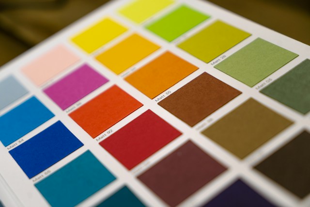
When you’re a startup, it isn’t good to think of blue as your primary color. Green is commonly associated with nature and the environment.
Think of colors in two ways; primary and secondary colors. It’s advisable not to go beyond 4-5 colors.
People associate red with youth and an exciting color, as well as passion and power.
Black symbolizes sophisticated brands. Pink is a ladies’ color. If your brand is targeting women, you can’t shy away from a pink color.
4. Brand logo
It’s a symbol or mark representing your brand or business and helps people recognize your business. It should communicate your brand’s values and personality to your audience using colors, shapes, typography, etc.
The first impression matters. Since it’s the first visual element your customers interact with, you need to design it more compelling.
5. Photography
Such are similar to graphics but serve different purposes. These are your brand imagery. When you’re working on your manual guide, it’s better to point out exactly what your brand photos need to look like.

Your powerful tool to communicate your brand story and create a visual identity for your brand. You need to use diverse models of your images to help your customers feel connected to your brand.
How to create a brand visual identity for your brand
Without a solid visual identity, you’re more likely to struggle with developing your brand loyalty. It’s better to ask yourself how you want your customers to feel whenever they see your brand.
1. Carry out your market research
Before you start your process, make sure you work on your brand foundation, essence, mantra, and messaging. List all your competitors. Check out their colors, shapes, typography, etc.

Start noting down their strengths and weaknesses. This way, you carry out the current situation in the marketplace.
You need to find out from top brands what is common with them. How can you differ from them?
Yes, it’s good to be different, but don’t be too different from your competitors.
Complete your SWOT analysis to know where strengths, weaknesses, threats, and opportunities lie compared to those of your competitors.
Discover: How you can DIY to position your brand
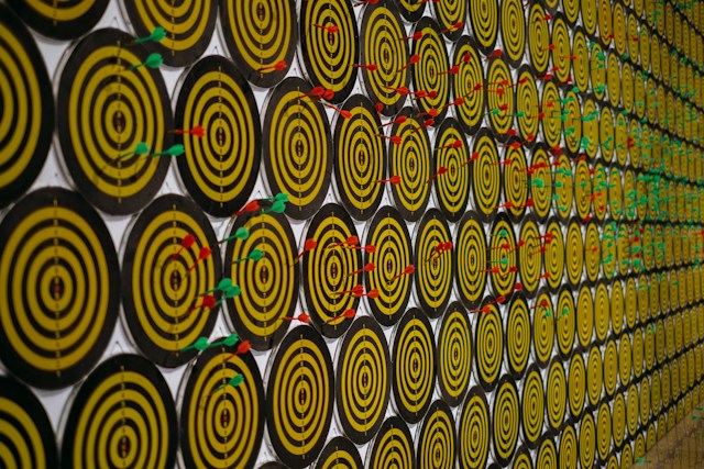
2. Set your targets
What do you want to achieve with your brand? Do you want to target women? Youth? Men? What? What market do you want to be in?

Think of such things before starting to create and develop your brand identity.
Look at your demographic profile, desires, pain points, and challenges of your avatars or ideal customer profiles. What are they struggling with and how will you help them?
Discover: How you can create unique value proposition for your brand
3. Develop a relatable brand personality
The question that comes to my mind with personality is if your brand was a person, what would it be?
Brand personality impacts your voice and tone used in all your marketing materials and other communications.

Your business needs to develop a compelling perception rather than mixing up all the positive traits within one.
Your elements will need to be in alignment with your personality and values to deliver a cohesive message. You need to think about how you’ll communicate with your audience.
4. Develop your unforgettable brand logo
Your brand is at the forefront of your brand identity design. This is the most important element to your target audience comes across.
In past, people thought making brand logos sophisticated was the only way to be different, but nowadays it’s the simplicity needed to be applied when designing a logo.
Discover: How you can maintain your brand consistency

Things to think of when designing a brand logo;
- Make it so simple
- Make it evocative
- Make it memorable
- Make your it versatile
- Make your logo timeless
5. Try to be unique
Try to be unique but not confusing at the same time. Since you need a few seconds to impress your customers, you need to be on point. Don’t blend in like other brands.
Making your brand completely different is good, but it may lead some of your target audience to shy away from your brand. That way, you need to balance your boat. Don’t differ completely from your competitors.
6. Maintain consistency
In this digital era, you’ll need to improve your visual identity from time to time. In making your updates, you’ll need to appeal to your target audience.
That way, you’ll need to maintain consistency at every stage of your brand journey. You should showcase the same essential visual components on all your platforms.
Discover: How you develop your brand strategy
Brand visual identity FAQs
Why is visual brand identity important?
Visual brand identity helps you establish your brand recognition, convey your brand values, and create a consistent and cohesive brand image, making it easier for your customers to connect with and remember your brand.
How does consistency impact visual brand identity?
Consistency ensures your brand elements are used uniformly across various platforms and materials, reinforcing brand recognition and building a cohesive brand image.
How does a strong visual brand identity impact my business?
Your strong visual brand identity fosters brand loyalty, distinguishes your brand from competitors, and enhances brand recall, leading to increased trust and recognition among your consumers.
How can a small business create a strong visual brand identity on a budget?
Focus on creating a simple but memorable logo, choose a limited color palette, and leverage affordable design tools. Consistency in branding of digital and print materials is key.
Brand visual identity conclusion
So, to wrap it up: your brand’s visual identity is like your unique style, making your target audience remember you in a busy world.
Just like wearing the same outfit everywhere, using the same colors and logos everywhere makes people recognize your brand easily.
This visual identity thing helps people trust and like your brand more. It’s a bit like having a cool, consistent look that everyone recognizes.
Remember, keeping things the same across websites, ads, and everywhere else is like keeping your style steady.
It’s how your audience remembers you and feels good about your brand. So, in a nutshell, keep your brand style on point, and you’ll stand out in the crowd.
Time to take action on your brand visual identity
Since you’ve known how to craft a killer brand visual identity, let’s put it into action:
Audit your brand
Inspect your current brand visuals. Do they align with the insights you gained from this article? Identify areas where you can enhance or maintain consistency.
Survey your audience
Reach out to your audience. What colors, shapes, or logos resonate with them? Use surveys or social media polls to gather insights. Your audience knows best.
Revamp your logo
Consider giving your logo a fresh look. Keep it simple, memorable, and aligned with your brand personality. Test it with a few trusted customers for feedback.
Update your colors
Evaluate your color palette. Does it reflect your brand’s personality? Make adjustments if needed and ensure consistency across all platforms.
Check your visual consistency
Scan your digital and print materials. Are your visuals consistent? Ensure your brand identity remains uniform across websites, social media, and marketing materials.
Engage with your audience
Share your journey of updating your brand visuals with your audience. Show them the process and ask for their feedback.
This not only builds engagement, but also strengthens your brand connection. Remember, taking these steps isn’t just about visuals; it’s about creating a lasting impression that resonates with your audience.
Now, make your brand visuals a genuine reflection of your brand’s unique story.

He specializes in turning SaaS startups into brands customers trust and buy from. He helps founders cut through the noise with a clear messaging and positioning strategy that drives conversions.
With 10+ years of background in branding and strategic communication, Rob has worked with startups struggling to stand out.
He understands the challenges of building a brand beyond a product and focuses on crafting unique value propositions that make SaaS businesses memorable and profitable.
If your SaaS isn't selling, it's not your product, it's your positioning. Let's fix that!


